When I started dogfooding our MCP, I realized our UX was completely broken inside a coding agent. Fixing it led us to a new way of designing: agent-first design. The UX comes to you. You don’t go to the UX.
Stepping back for a second: QA Wolf is an agent and infrastructure for building, running, and maintaining end-to-end tests. Up until recently you managed your test suite through our app. If developers or testers wanted to build a new test, they’d log into app.qawolf.com and talk to the agent.
But that’s not how people work anymore. Now we have coding agents (Claude, Cursor, Codex, etc) going all day, running every which way doing things for us.
I do everything from design to development to testing inside a coding agent or CLI. While I’m using different agents and tools for different tasks, for the most part all my work is in one window—and the user experience of those tools has to fit into it seamlessly.
Where our UX broke
The first time I opened a test inside my coding agent, it brought the whole platform along with it: primary and secondary navigation layers, test metadata, video replays and other historical run artifacts. Great if I’m doing work inside the app. But now I’m steering the work through my coding agent and it’s getting context through the MCP.
The navigation and controls for starting and managing tests were taking up space and duplicated a lot of the functionality I was using my coding agent to accomplish.
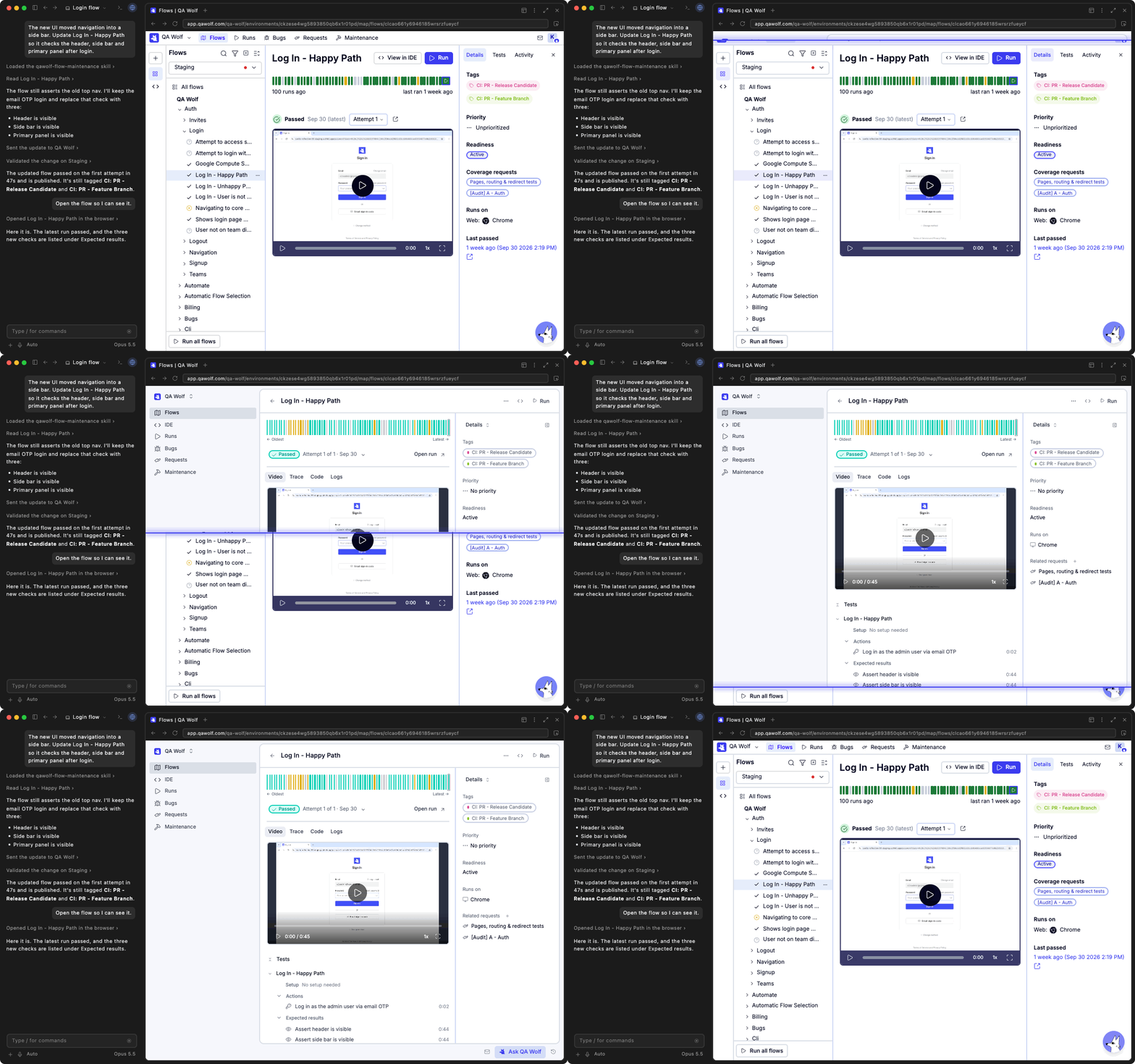
So we started stripping the UI down to task-oriented views showing just the essentials for the task at hand: the test, the browser where it runs, its progress and results, and a clear request when something needed our attention. Each view had to make sense on its own, fit beside the agent conversation, and let us review the work without navigating through the rest of the platform. It had to complement the active session, not feel like a separate app in a split view.
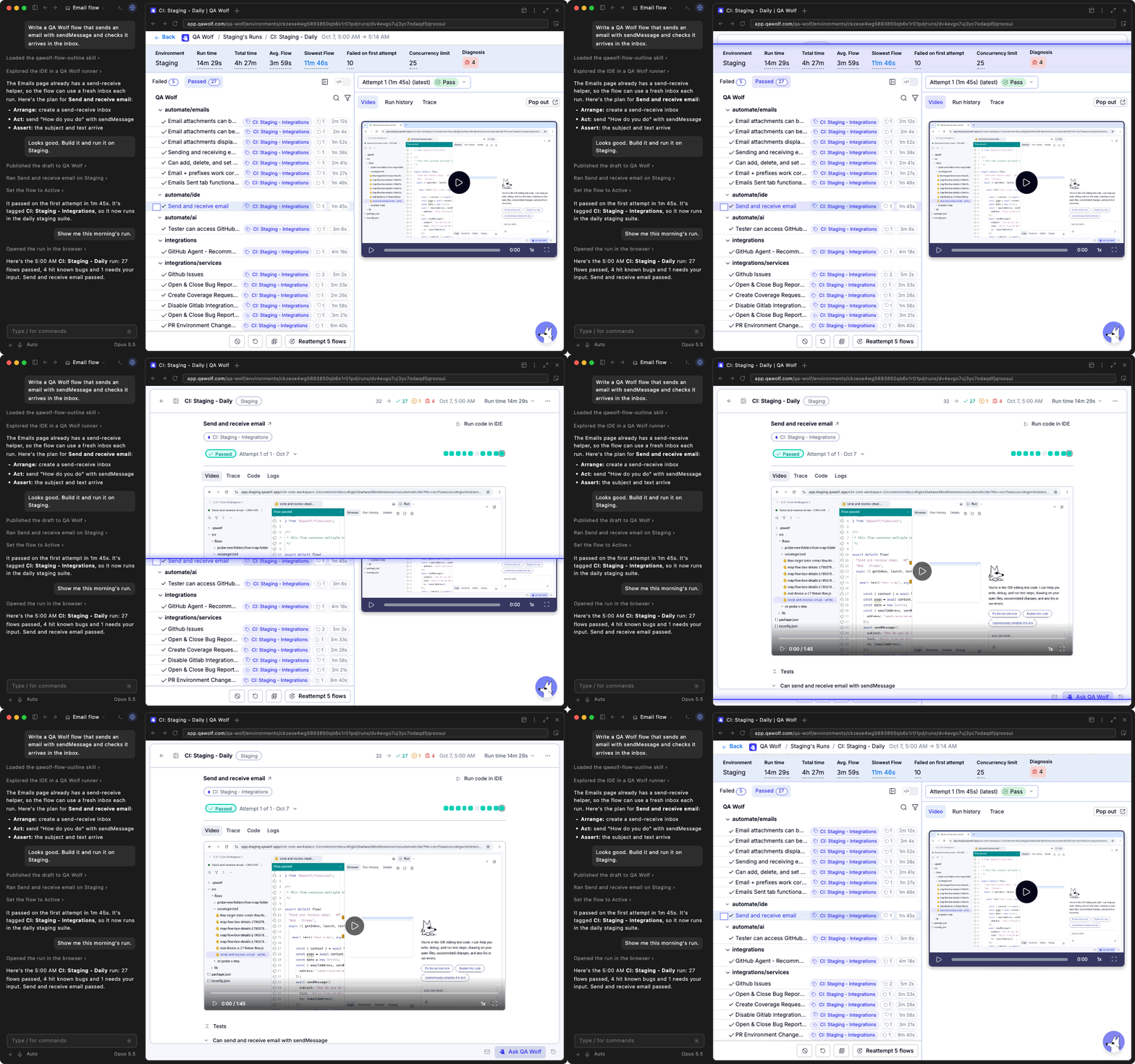
Focused views work within any context
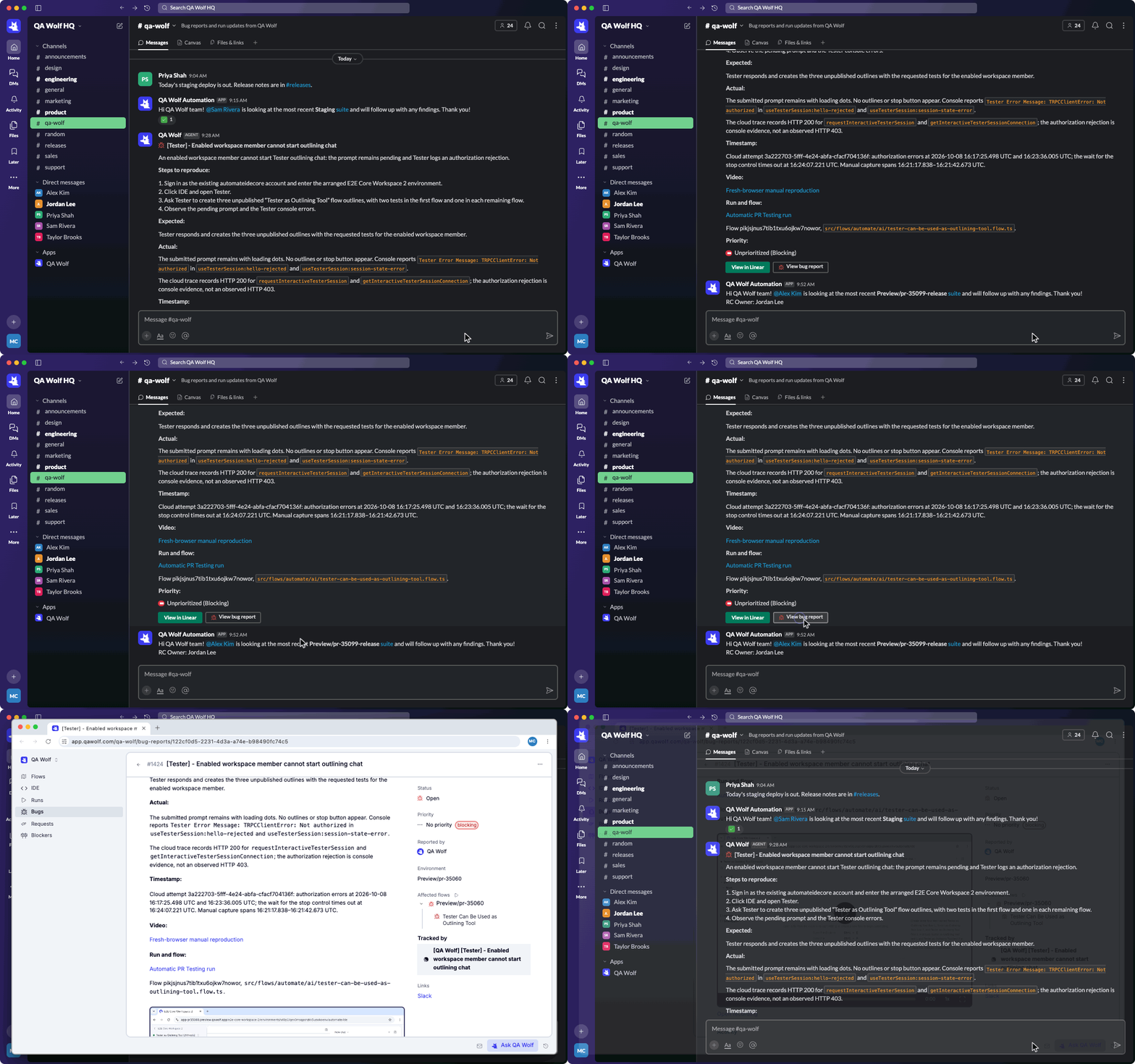
While most of my development work happens inside a coding agent, I’m also bouncing between Slack, GitHub, and Linear. And I send tasks to various agents through all of them. Simplifying the UI into focused views lets an agent take a user directly to the information they need, from wherever they happen to be.
Designing for an MCP experience created a cleaner UI overall
You can still work entirely inside QA Wolf, using our chat to create tests, follow their progress, and review the results. Creating, following, and reviewing a test needs the same information wherever you're working, so the focused test view became the starting point for redesigning the experience inside our app too.
Working out what belonged in that view also forced us to revisit the surrounding features. Some still had a purpose elsewhere in the app. Others added steps to work we could already complete through the agent and the focused UI. We could cut those features and simplify the workflow across both places.
It felt a lot like mobile-first design. This time, we were fitting into the agent's browser pane beside a conversation instead of a phone screen. The constraint made us reconsider what was essential. Simplifying that one view became an opportunity to simplify the product.
That’s the larger lesson we took from building for MCP: the future of product design isn’t about creating a better place for users to go. It’s about bringing the right piece of the product to them, in the context where they’re already working. UX comes to you—not the other way around.
